Westpac Bank
Helping KiwiSaver customers understand their investment.

About
Westpac is one of New Zealand’s largest banks with close to 1.5 million customers nationwide. They offer a lot of investment options to their customers, all with their own complexities in how they work.
KiwiSaver, a voluntary savings scheme to help set New Zealanders up for retirement is one of those options. Internal research found that a large chunk of KiwiSaver customers don’t understand their fund choice and aren’t aware of the little modifications they can make to vastly increase their balance at retirement.
With these problems to solve, I led the design of a year-long discovery and delivery of digital products to help educate KiwiSaver customers and help them make better decisions for their future.
My role
— Product design lead
— Workshop facilitation
— User research planning
— User research facilitation
— UX/UI design

L to R: Kick-off workshop running out Post-it space, a sprint demo, remote user testing set up during lockdown.
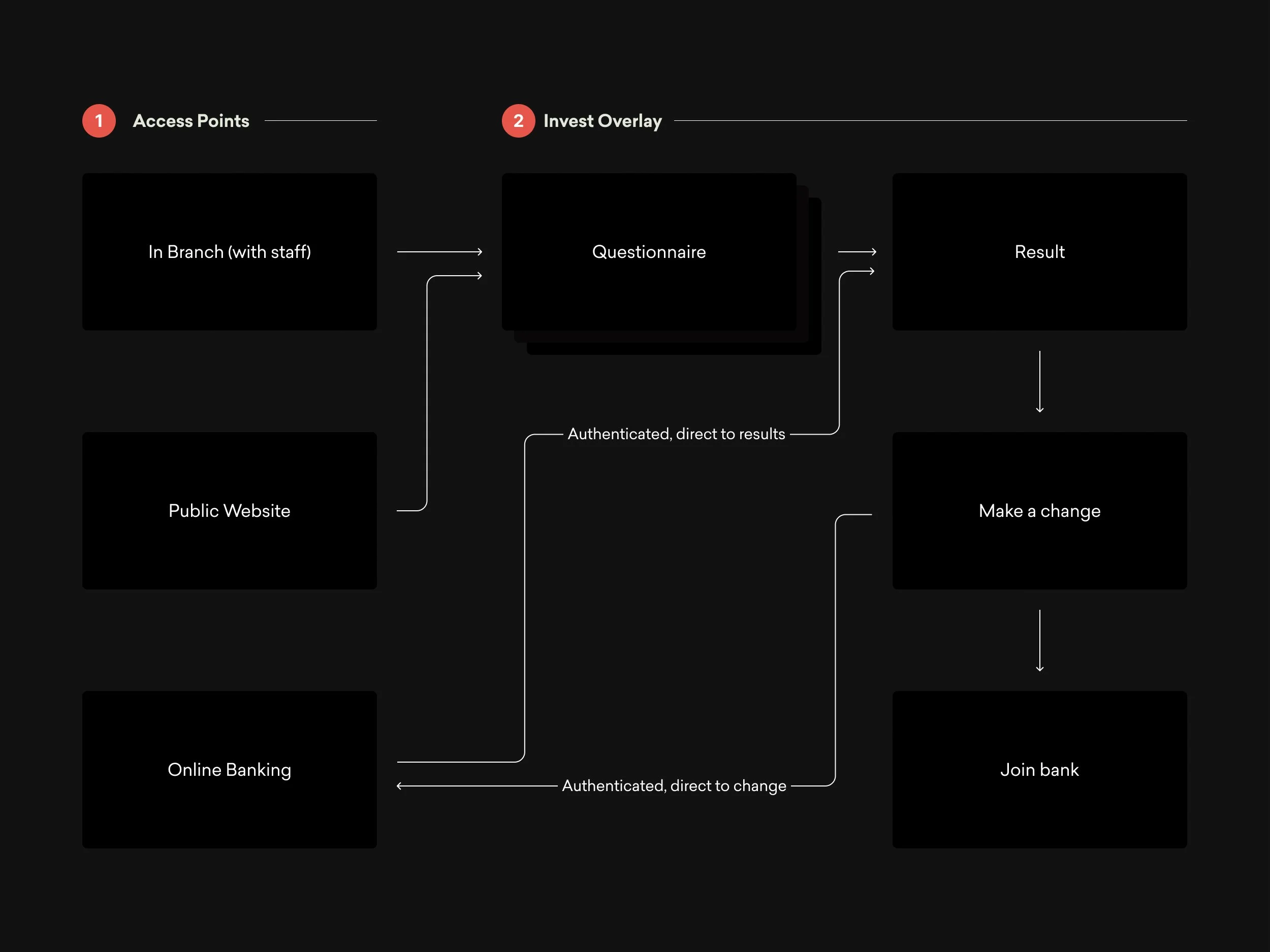
Multiple access points
After running the kick-off workshop it was apparent that we needed a strategy to access these digital tools as there were multiple entry points for them. The first challenge was the mixing of new and old. Westpac was going through a brand refresh, but not all experiences were being updated in parallel. The second was that the tools would be accessed from a CRM in-branch by staff to help guide conversations with customers and give financial advice. To make this seamless, we designed the ‘Invest Overlay’, a full-screen overlay to easily access and exit the tools, no matter where you entered from.
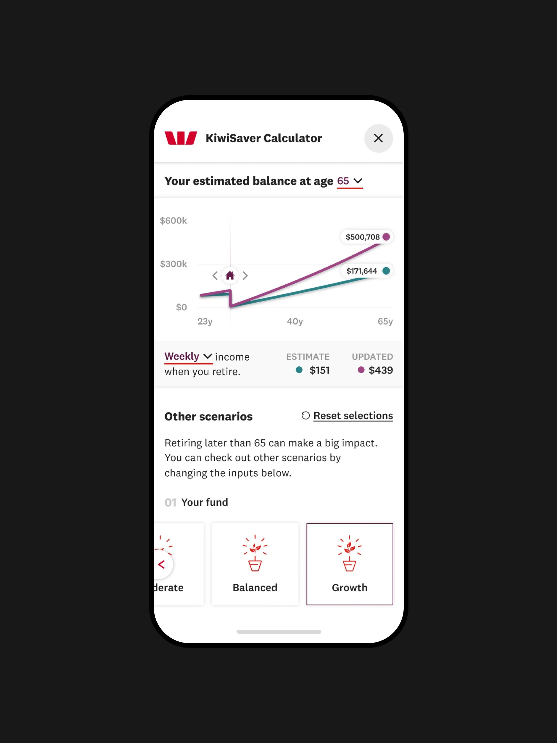
Inputting details
When launching the tools, customers are asked to input information about themselves so an accurate projection can be given. We didn’t want to overwhelm them with a wall of forms, so designed the product to have one question at a time, large selectors and snippets of information to help educate customers along the way.

L to R: KiwiSaver Calculator Results, KiwiSaver Fund Chooser Results.
Getting it right for all screen sizes
Through our competitor analysis and customer research, we found that the experiences weren’t optimised for mobile. When customers check other scenarios they are forced to scroll back up to the graph to see the difference they could make. Talking to customers we found this proved a point of frustration. Through our iterative approach, we landed on a fixed header that intuitively changed depending on where the user was on the page to help them easily see the difference their selections made.